Follow a few basic guidelines
- Use fonts that are easy to read
- Keep it simple and don't overthink the design process
- Play with different colors for your logo, but be sure not to make them too similar in shade or color
- Get feedback from others who know what they're talking about when it comes to logos
- Be confident in your logo - if you like it, then other people will too!
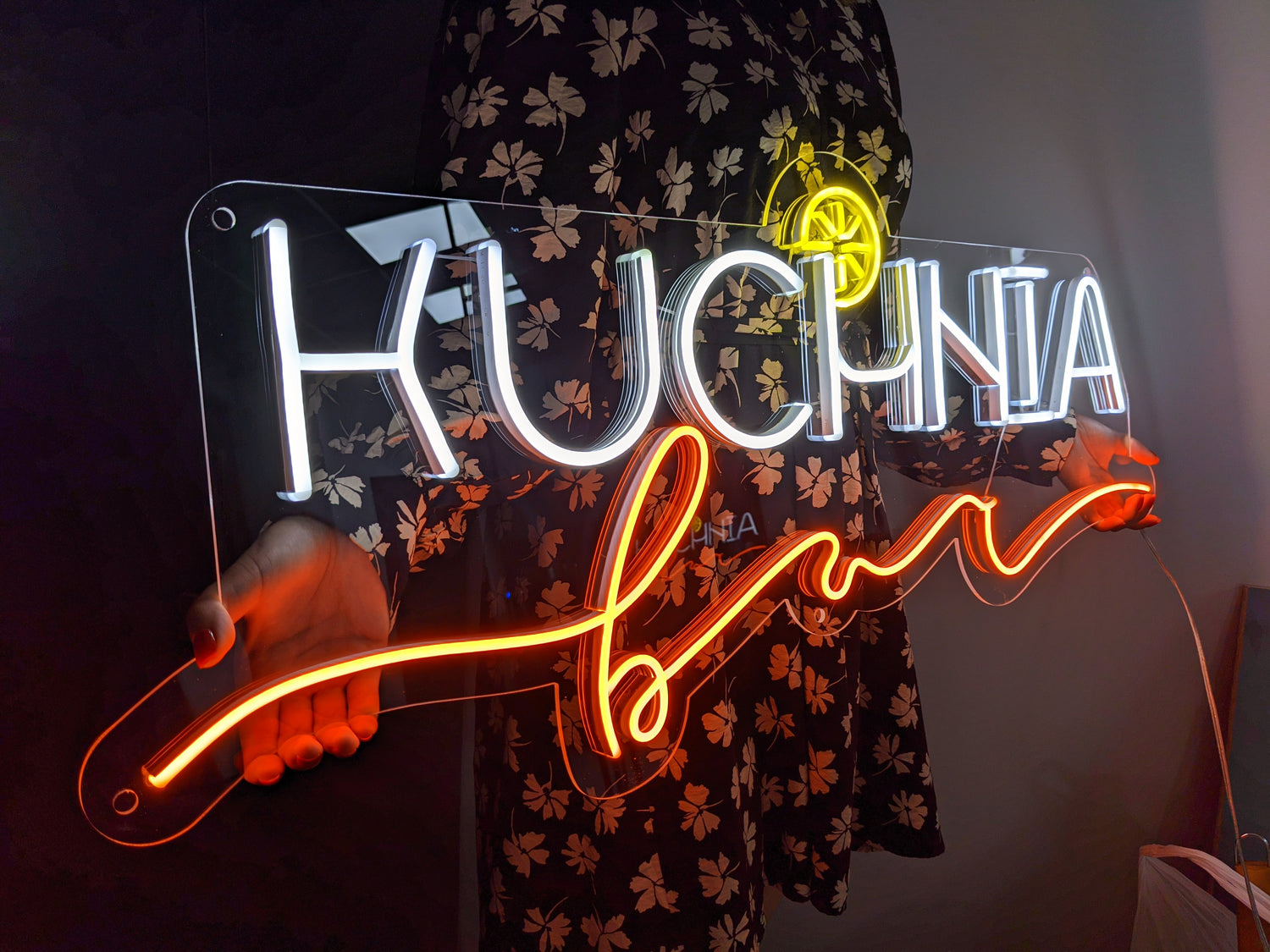
The neon sign has been a symbol of the American Dream for decades, and with good reason. It's simple, iconic, and easy to read. With this in mind, it's no surprise that many businesses want their logo to be an attention-grabbing neon sign as well—and there are some tricks you can use to get just that! Here are a few of our favorites:
- Consider what colors will work well together. The colors in your logo should contrast with one another so they pop! Colors like blue and yellow or green and pink are great combinations. Avoid using too many colors because it can be difficult to see one color against another when there's a lot of them on the page. 3-5 colors are usually enough.
- Choose fonts that complement each other without being too similar. An easy way to do this is by choosing fonts from different font families (e.g., serif vs sans-serif).
The neon sign is a great way to stand out in the crowd and get your logo noticed. With these neon sign tips, you can have an eye-catching image that will be sure to catch customers’ attention. If this sounds like what you need for your business, contact us today! We would love to help make it happen with our wide selection of colors, shapes, sizes, and more!


Leave a comment
This site is protected by hCaptcha and the hCaptcha Privacy Policy and Terms of Service apply.